Update: Thank you Mothership for sharing our post! Treat you guys kopi soon, okay?
Eunoia Junior College is Singapore's newest JC, with its first batch of students coming from Catholic High School, CHIJ St Nicholas Girls’ School and Singapore Chinese Girls’ School. The pioneer batch was very involved in creating the school's identity, from the school uniform to the school's anthem. Eunoia's visual identity was crafted by Kong Studio, a local design firm which apparently excels in Western-Oriental branding projects. EJC's visual identity is no exception.
Eunoia Junior College is Singapore's newest JC, with its first batch of students coming from Catholic High School, CHIJ St Nicholas Girls’ School and Singapore Chinese Girls’ School. The pioneer batch was very involved in creating the school's identity, from the school uniform to the school's anthem. Eunoia's visual identity was crafted by Kong Studio, a local design firm which apparently excels in Western-Oriental branding projects. EJC's visual identity is no exception.
School Crest
 |
| School Crest + Wordmark. |
"The college crest can be understood by three qualities, or simply A-B-C : All-round Development, Beautiful Thinking and Cultural Conversance."
The English word "Eunoia" was configured to look like a Chinese seal, which represents the students' ability to thrive in diverse cultural settings, while remaining rooted to their own culture (C). The crest was inspired by neural networks of the human brain (B), and the round shape represents holistic development of the students (A). More information on EJC's website.
Let me just remind you that this is school branding, because this is unlike anything we've seen before in the education sector. Polytechnics do have their relatively modern logos, but it is hard to decipher their meanings due to their abstract nature. As for JC logos, they don't even come close to this. This, however, is unique and memorable – just by glancing at this crest, I can see that this mark is both Western and Asian, signifying the balance and harmony between the 2 cultures. EJC used its position as a new JC to create something which is trendy and less corporate, which makes the identity more approachable.
Typography
 |
| The meaning of the word "Eunoia". See the outlined letters? *mindblown* |
I was pleasantly surprised to find a typography guide in Eunoia's style guide. Heck, I was overjoyed when I first found out about the existence of Eunoia's style guide.
The usage of FF Mark for headers, especially in bold/heavy, makes every graphic poster very distinct. While most schools are using either serifs or scripts, Eunoia is cleverly securing this up-to-date font for themselves. If you are wondering why this font is so familiar, Mastercard uses this font, and Hillary Clinton's campaign used a very similar font called Sharp Unity. Big and bold is definitely the way forward.
For the body, Avenir is used. The sans serif font is a safe choice, but still a great pair with FF Mark nonetheless.
 |
| Using different styles from the same font family to create a more unique identity |
 |
| Pay attention to the colours! Make it POP |
 |
| I won't be surprised if the exam paper cover page is just as fabulous |
Colours
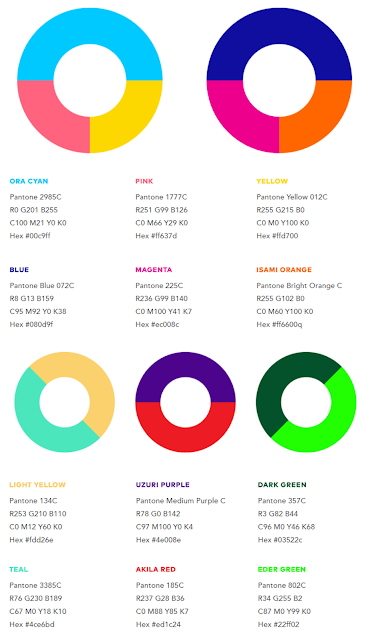
I would be so happy if all schools had such a detailed style guide like Eunoia's, which even has its own colour guide.
The dark blue/gold pairing has always been popular, with ACS, AJC and IJC using different shades of the 2 colours. But not to worry, EJC has plenty of other colours to choose from when designing publicity materials.
Given the vibrancy of the colours, it would be easy to fall into a trap where the graphic is overloaded with colours (rainbow diarrhoea). However, as shown in the OH poster, EJC definitely has some trained professionals doing great design work.
Overall, EJC outshines other schools in terms of visual identity. For a generation which is increasingly design savvy, I'd say that EJC is able to leave a lasting impression in our heads. The branding work here is proof that pretty much anything can be made to look visually appealing, and it sets the right tone for learning – something fun and exciting.
 |
| College colours |
 |
| Colours from EJC's 5 Houses and partner schools |
 |
| Open House poster. Just wow. |
Overall, EJC outshines other schools in terms of visual identity. For a generation which is increasingly design savvy, I'd say that EJC is able to leave a lasting impression in our heads. The branding work here is proof that pretty much anything can be made to look visually appealing, and it sets the right tone for learning – something fun and exciting.
As for the existing educational institutions, it's time to return to the drawing board. If a school which does not even teach design produces something more impressive than an institution which has a design school with over 100 students, there's got to be a problem somewhere.
External Links
I find Eunoia JC's Visual Identity...


CONVERSATION