
Shine bright like a diamond.
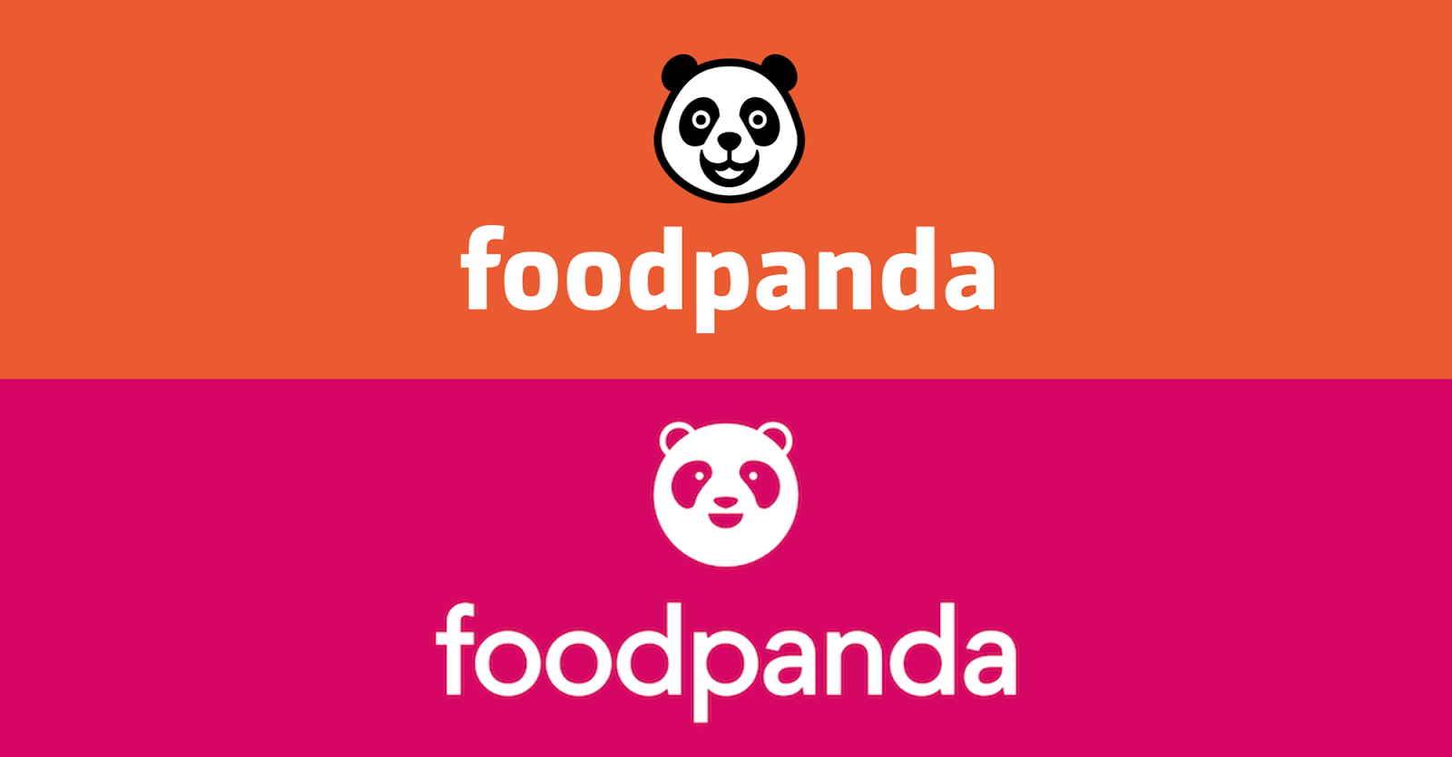
Foodpanda (stylized as foodpanda) has come a long way since its beginnings as a humble food delivery startup just 5 years ago. First launched in Singapore, the company grew rapidly within a year to operate in 23 countries, spanning 4 continents. A few weeks ago, the bright orange brand identity was replaced by an even brighter pink one in a rebrand that has changed the branding game for the local food delivery industry.
Pink Power
In an increasingly crowded marketplace of food delivery services, having an eccentric brand identity can leave a greater impression in the minds of potential customers. When it comes to the brand colours representing Foodpanda's competitors, Deliveroo's teal *literally* pales in comparison, while Uber Eats' black/green combination blends in easily with any other vehicle on the streets. Foodpanda wins with its highly visible (hence easily recognisable) neon pink.
 |
| Some of Foodpanda's competitors in Singapore. |
I have to admit, when I first saw the delivery riders in pink, I was a little overwhelmed. I imagined unicorns leading this rebranding effort, resulting in this bright identity.
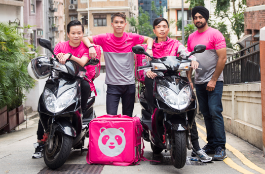 |
| Delivery guys rocking the pink identity. |
Laura Kantor, Foodpanda's marketing head, said "pink will be a strong differentiator for Foodpanda to stand out in markets in which orange is used extensively throughout the cities´ landscapes." Indeed, the eye catching colour can make people spot a Foodpanda delivery bike from an MRT train.
Of course, Foodpanda is not the only food delivery service which uses a bright colour for its brand identity - Honestbee uses bright yellow for its logo. I was slightly taken aback when I first saw the delivery riders in pink because the colour is rarely used for a company with unisex appeal. Barbie is pink because, well, it's aimed at a female audience. Both men and women order food, so it is unlikely to see pink representing a food delivery company, much less neon pink.

Foodpanda saw an opportunity for them to include a shock factor when unveiling its new brand identity and seized it. I won't forget the feeling when I first saw Foodpanda's new identity. Brands pay millions to create such strong impressions. Bravo for succeeding!
Hello Panda
While the new brand identity features a rather intense colour, the same thing cannot be said about the new panda icon. The previous iteration of the panda stared into your soul; it demanded your attention and its eyes seemed to hypnotise you into ordering from Foodpanda and giving a fantastic review. Yes, orange panda's eyes could be tweaked to appear more friendly, instead of creepy-friendly, but this change to the dot-sized eyes for the pink panda was too much.

Our new panda has a new problem: its eyes cannot be seen when the logo is tiny. An example would be Foodpanda's own website. You have to squint your eyes to see the panda's eyes!
Other than the vanishing eyes, the icon looks pretty solid, ticking every requirement to create a trendy logo. Simple shape? Check. No outline? Check. Duotone? You bet. While not as simple looking as the blocky Deliveroo logo, this panda still retains its cuteness without being as aggressive as its predecessor.
 |
| "Eat or die", whispers the panda. |
Diet Wordmark
These days, wordmarks are hardly seen as logos are increasingly confined to square dimensions. Still, they are important in building brand recognition and frequently appear in print advertisements and official documents.  |
| Foodpanda on Facebook. No wordmark, not even on photo posts. |
 |
| Foodpanda's wordmark, before and after. |
Just like the new panda, the wordmark strips itself of any quirks and started to hit the gym. We have a now-generic geometric typeface to complement its perfectly rounded panda. It's not bad that a geometric font is used, just cliche (hey, it could be worse). Then again, the identity's star is clearly its brand colour, so this wordmark is just a supporting element.
Bonus: Foodpanda's first logo
While we are all familiar with Foodpanda's orange logo, it wasn't the company's first. In 2012, Foodpanda had a rather exotic identity,
 |
| Foodpándá |
They did not change their name; this wordmark was supposed to be read as foodpanda, not foodpándá. Wonder who thought it was a good idea to add leaves above the As. Was it to make it more Asian? To sell the 'panda' part of Foodpanda?
I continued to explore this rather bizarre identity and found out that the panda looked more like Papa Bear from Goldilocks and the 3 Bears.
 |
| I guess back in the day, more details meant better design, so the panda better had pants, worn extremely uncomfortably. |
In any case, you should hope that anyone delivering food to you would not have this face:

I'm just glad that this is identity is no longer used. It's now just a small part of Foodpanda's interesting panda history.
Eh, don't bluetick leh, participate in this poll and leave a comment. Follow us on Facebook and Instagram as well!
I like my panda


CONVERSATION