

I'll have 2 projects with extra designs, please
Whether you keep up with the news or not (looking at you millennials), you would have likely seen or heard of Marina One and Duo. Duo's close proximity to Haji Lane and Marina One's eye-catching appearance have mystified passers-by for months now, and attracted shutterbugs wanting to capture the stunning architecture of both projects.
During the official opening of both developments by the Prime Ministers of Malaysia and Singapore, news outlets from both sides of the causeway hailed this as 'symbols of strong bilateral ties'. I believe these 2 projects are also symbols of Singapore's dedication to push the boundaries of innovation, art and design.
 |
| No one's comparing button sizes when there's a bromance! |
Here are my thoughts on Marina One and Duo's branding and design.
Duo's Branding

Duo's logo is...questionable. This is an atas working space and residence, but they went with a preset Photoshop gradient option to cheapen the identity. I get the idea of making the logo grey to reflect the actual hexagonal metal patterns on Duo's buildings, but it looks lazy and dated. In order for the logo to be seen as forward-looking and futuristic, they could have played with the texture, used different shades of grey to create a 3-D effect (use your imagination and imagine 'U' as a cuboid as seen from a side view), or simply stuck with a solid space grey fill.
 |
| Duo's signature hexagon pattern facade |
Duo's 'D' looks out of place because it was craved out from an octagon, as opposed to a hexagon. Again, I get that they did they not want to make the 'D' too thin and affect the balance of the overall logo, but they could have tried to make the 'D' more hexagonal. My 2 cents:
 |
| This was just a 5-second copy and paste job; you get the idea |
Also, can we talk about that registered trademark symbol? While I appreciate the effort taken to create a hexagonal 'R', the symbol's huge size distracts the audience from the actual name of the project. The only beneficial way to use this is if the 'R' stands for Duo Residences/Retail, effectively differentiating the different parts of the property for clarity.
Even if the 'R' and hexagon circling it fits well with the other elements of the logo (even better than the 'D'), it robs the asymmetric 'U' of the attention it deserves.
 |
| Missed opportunity to present the different parts of Duo |

Duo's brand applications feature geometric shapes and patterns which complement the logo well.

However, the geometric aesthetic is no where to be seen on Duo's website. Duo's architecture might have something to do with these circular designs.

For Duo's overall branding, apart from some minor issues, it is an okay identity - the idea works but the execution could have been better. The issues I pointed out are not fatal; I just expected more from a multi-national partnership project.
Duo's Architecture
The circles on Duo's website are based on the curved towers at Duo. It might also be sending a subtle message that it has a wholesome range of amenities, is at a good location and promotes harmonious living.

Duo is designed by Ole Scheeren, known for creating other iconic landmarks in Asia including The Interlace. Its location, in the heritage-rich areas of Bugis, reinforces the belief that the old harmonises with the new in Singapore.
More sketches and artist renderings can be found on the project page.

 |
| The idea behind Duo's shape |
Other noteworthy Stuff
1. Supermama was tasked to design a special set of plates for every Duo residential unit. Priceless.


2. 'Poetics of Convergence' is a series of 6 art pieces by Singaporean and Malaysian artists, placed in public spaces at Duo.
3. André Fu of A.F.S.O. designed the lifestyle hotel at Duo, Andaz Hotel by Hyatt.
Marina One's Branding

The brownish-gold square with squiggles are supposed to resemble the different wavy floors of Marina One. Playing with the thickness and transparency of the lines can make a viewer think that the logo is messy or super classy. I would not take that risk.
There's just too many things going on here, from gradients to messy lines to varying transparencies. What is the logo trying to convey exactly?
Like Duo, this mixed development consists of residential, work and retail spaces. Their logos are differentiated by colour.
 |
| I was only able to find this low-res logo set - the colours are correct but for Marina One Retail, it has been changed to Marina One The Heart |

When it comes to brand applications, Marina One is struggling to find a recognisable design pattern to use across its marketing materials. What's worse is that the flat version of the logo looks bad - it's not optically balanced and the layering is non-existent.

Marina One's Architecture
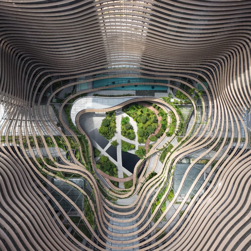
A place like Marina One is something I would expect to see in a sci-fi film. This was the poster-child of the joint venture, as lifestyle sites gushed at how Instagram-worthy the place was. Designed by Ingenhoven Architects, they essentially brought the future to the present.
But Marina One is not just about all about the looks - it was designed from an eco-friendly perspective as well.
The stepped gardens of Marina One were inspired by Asian rice terraces to keep the surrounding environment cool. They also make up to be largest green urban sanctuary within Singapore's CBD. If you want to take pretentious pictures be in touch with nature but not be at the mercy of the hot weather, go to Marina One instead of Gardens by the Bay.
So far, we have man-made Supertrees and now man-made 'rice fields'. What's next?
So far, we have man-made Supertrees and now man-made 'rice fields'. What's next?
 |
| Sketch of Marina One. Can we have this as the logo instead? |
Awesome Architecture, Bothersome Branding, Designing for Decades to come
Duo and Marina One will be in the history books documenting the bilateral ties between Malaysia and Singapore. With such great architecture, especially the soon-to-be-iconic Marina One, I cannot wait to see how Singapore properties will be designed in the future. We are indeed living in times of the future, where design is not only aesthetically pleasing but also sustainable.
The only thing which missed the mark was the brand identities. Then again, with such fantastic architecture, people will remember how they look instead of the logo, as they should.
Eh, don't bluetick leh, leave a comment. Follow us on Facebook and Instagram as well!
The only thing which missed the mark was the brand identities. Then again, with such fantastic architecture, people will remember how they look instead of the logo, as they should.
Eh, don't bluetick leh, leave a comment. Follow us on Facebook and Instagram as well!


CONVERSATION