Power to choose
When the Open Electricity Market (OEM) was first announced, I wondered about how this was going to be advertised to every Singaporean household (well, that and feeling excited about all the new brand identities to review :P). Just imagine receiving a brief which lists its target audience as "Singaporeans who need to pay their electricity bills" - so much for a target. Let's see how Grey Group tackled this challenging task.
OEM and its sentient spokespersons
What elevates this simple wordmark to a new level is when it is in motion. Take a look at this TV ad, and pay close attention from 0:41 onwards:
It was a pleasant surprise to see the O take on other electrical appliances such as fans, radios and washing machines.
| icons (Source) |
The icons look great, although I'm not sure if millennials know what old-school radios look like anymore.
In keeping with the theme of self-aware electrical appliances, the campaign also released posters of the concerned toaster and smart microwave, along with their other friends.
What makes these posters seem irresistible is the bold pop-art colour scheme which conveys a cheery tone. Remember, changes are prone to resistance, so the priority is to relieve fears and highlight the benefits, in this case done in a non-threatening, lighthearted way.
 |
| Because flamingo decors are a thing among the young (Source) |
 |
| Something about this huge talking iron just makes me laugh (Source) |
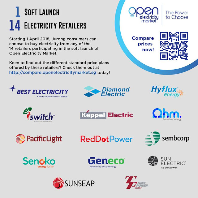
Notable Players in the OEM
Of course, when I talk about notable players, I'm referring to the aesthetics and graphics of the electricity providers, not the energy plans and their financial savings. With so many players in the market, standing out is a must to ensure survivability. After some site browsing, here are some things which caught my eye.
Ohm's Directness
Ohm's tagline, "fuss-free energy", is something which is taken seriously, as far as marketing's concerned. The following ads put companies with extra fluff to shame.
In the copywriting world, their philosophy does not beat around the bush.

Ohm gets it - with Singapore's relatively reliable electricity record, we would worry more about cost instead of quality, especially since changing providers does not change where the electricity comes from. Those who want to see their cost go down without bells and whistles would be drawn to Ohm.
iSwitch's logo history
iSwitch's about us page gave us an idea of how their logo came about.
Pacific Light's Bubbly Personality
Pacific Light's logo looks intimidating, like the Strepsils logo gone rogue (by the way, SP Group wins the best Strepsils logo lookalike contest).
However, everything around the brand screams fun and happiness. Their most prominent brand element is an orange circle, which they repeat over and over until it becomes a pattern. I suppose it represents the electricity current.
Their icon library is filled with these circles and random bursts of orange, which gives this firm a youthful vibe.
Even their plans are casual, I can double confirm.
However, everything around the brand screams fun and happiness. Their most prominent brand element is an orange circle, which they repeat over and over until it becomes a pattern. I suppose it represents the electricity current.
 |
| The animated version of this is livelier |
Even their plans are casual, I can double confirm.
Geneco's Iconic City
When an international firm sets up a local branch, expect to see the classic Singaporean icons such as the Marina Bay Sands and Gardens by the Bay's Supertrees. Geneco did that and so much more, in the eye candy blocky aesthetic.
Who would have thought of using the Parliament House in an ad as a unique Singaporean landmark? Then again, it does make some sense, as long as you are not scared of potential legal trouble.
The 3 main colours also contrast each other nicely, creating bold and striking graphics.
Geneco also loves to participate in local happenings, going beyond the typical holiday promotions of most companies.
 |
| Trump-Kim Summit |
Other Noteworthy Graphics
"CirclesLife would like to have a word"
They should actually consider doing this IRL - put neon signs to shame!
Best Electricity's employees are also Olympic hopefuls
To Switch care or not to switch care
Electricity is understandably a boring subject to many, hence the extra push by some players to create an eye-pleasing aesthetic. Much like the disruptors of the telco and travel industry, some of these new firms face uphill fights against established brands with strong brand recognition (Keppel, SingTel and Semcorp). Thus, we should expect more out-of-the-box campaigns as the newer firms attempt to attract more eyeballs to them.
As for me, no matter what campaigns are thrown at us, nothing beats this image you are about to see next, courtesy of OEM's talking iron.
As for me, no matter what campaigns are thrown at us, nothing beats this image you are about to see next, courtesy of OEM's talking iron.
 |
| This is priceless |


CONVERSATION