
"Into its fourth edition, the Singapore Design Week (SDW) 2017 will be held from 3 to 12 March 2017. The annual SDW brings together a collection of local and international design activities in Singapore, assembling more than 100 design events and activities, including design trade shows, conferences, showcases, exhibitions and workshops that span various design disciplines."
-SDW

What an exciting week it has been for designers in Singapore. I attended SDW's feature conference, the Innovation By Design Conference and was pleasantly surprised at the turnout this year – far more people as compared to the first edition last year. It is truly reflective of the increasingly design conscious society we live in.
SDW 2017 consists of many events, but for this blog post, I will only go through the overall visual identity plus the different variants of the identity for SDW's Design Trails, the Design, Make & Craft Fair and the Design By Innovation Conference.
The promotional video got me hyped up for the programme, and so were the participants of the IDC when they played it to officially kick off the conference. The glitch effect plus the alternating colours of the words makes the information loud and memorable.


The pointy shapes continue to give SDW materials a unique look, from image frames to map locations. However, these physical materials seem to lack the punch and wow factor. Although the identity is coherent and recognisable, the full glory of the identity could only be seen in the animation. I believe the reason behind this is the dark theme of the overall brand.
From far, these booklets look like they are designed in the camo style, except with different colours. This is ironic as it the opposite of the visual identity intention – to "put ideas and inspirations of design at the forefront and reveal vibrancy". What I see here is a dull design. If only the colours were more vibrant...
By comparing the 2 booklets from SDW and SDW's design trails, you should be able to see the missed opportunity for the overall SDW visual identity to be more outstanding. The visuals on the Design Trails booklet are more eye-catching; each shape clashes with the other which accurately reflects the bold design, instead of the overall design where the shapes seem to melt together because of the colours.
The patterns in this variant are also relevant to the event. For example, the houndstooth pattern exploded in 2016's fashion scene.
The only issue here is that orange does not provide much contrast to red (SDW logo), so this is not the best colour combination.
This is the boldest variant of all, due to the black/white combination and the use of a simple line pattern. Actually, this can pass off as a fashion show poster!
The branding for SDW was consistent and easily recognisable – there were clear rules for each variant, allowing viewers to connect these events under the SDW umbrella. Using dark colours did not match the mission of the visual identity, however.
As the SDW draws to a close, I hope that the participants learnt something about their craft, and will pursue their dreams, just like how I am currently with this blog. After all, fellow designers, this is our age of glory.
Eh, don't bluetick leh, follow us on Facebook and Instagram!
SDW 2017 consists of many events, but for this blog post, I will only go through the overall visual identity plus the different variants of the identity for SDW's Design Trails, the Design, Make & Craft Fair and the Design By Innovation Conference.
SDW 2017 Logo
 |
| (I was unable to find a transparent SDW 2017 logo with the tagline) |
The SDW logo has been constant for the past 4 Singapore Design Weeks, but this year, a tagline was added to the logo. Just by looking at this logo alone, it feels messy because of the different red shapes attached to the letters and it makes me feel uncomfortable (the overall branding of SDW 2017 complements this logo, however).
I question the purpose of putting a '3' inside the 'A' for the tagline. The date of the SDW is clearly stated in the logo itself, so most people are able to sense the double meaning of the tagline. As that application looks forced, it adds to the messiness of the logo.
SDW 2017 Overall Branding
"Design surrounds us but is often “hidden” or “camouflaged”
from our view, perception or consciousness. The main visual for Singapore
Design Week 2017 therefore, puts ideas and inspirations of design at the
forefront and reveals the vibrancy of Singapore’s design sector."
-SDW
This year's SDW brand identity was created by design firm Xodbox. It features a mashup of pop art and low poly-like geometric shapes, and it complements the logo of the SDW well. It is not easy to pull that off, considering how the SDW logo can be described as abstract at best.
 |
| Highlights of SDW |
While most of the graphics are purely decorative, the shape which the logo sits on is actually an edgy (literally) silhouette of Singapore. It might not be obvious to see at first, but once you spot it, it becomes very obvious in other brand applications of SDW.
The promotional video got me hyped up for the programme, and so were the participants of the IDC when they played it to officially kick off the conference. The glitch effect plus the alternating colours of the words makes the information loud and memorable.


 |
| Taken from the SDW 2017 Booklet |
 |
| Taken at Singaplural |
From far, these booklets look like they are designed in the camo style, except with different colours. This is ironic as it the opposite of the visual identity intention – to "put ideas and inspirations of design at the forefront and reveal vibrancy". What I see here is a dull design. If only the colours were more vibrant...
Design Trails
Yeah, colour! Now we're talking! While retaining the shapes, this variant features more elaborate patterns, which really remind me of Uber.
 |
| Post on Facebook |
 |
| Advert on Instagram/Facebook |
 |
| Transportation (Can you spot the Singapore silhouette?) |
 |
| Booklet. I love how they used an arrow pattern to suggest travel! >>> |
Design, Make and Craft Fair
 |
| Post on Facebook |
 |
| Advert on Instagram/Facebook |
The only issue here is that orange does not provide much contrast to red (SDW logo), so this is not the best colour combination.
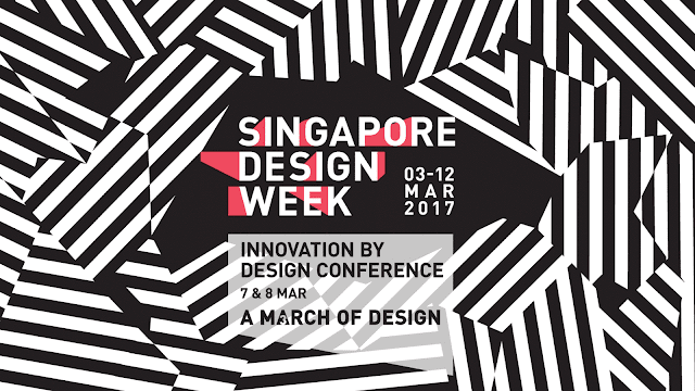
Innovation By Design Conference

This is the boldest variant of all, due to the black/white combination and the use of a simple line pattern. Actually, this can pass off as a fashion show poster!
 |
| Speaker Bio |
 |
| Conference Hall. Notice the edgy stage! |
 |
| Signage |
 |
| My lanyard and booklet! |
 |
| Conference web app |
Conclusion
The branding for SDW was consistent and easily recognisable – there were clear rules for each variant, allowing viewers to connect these events under the SDW umbrella. Using dark colours did not match the mission of the visual identity, however. As the SDW draws to a close, I hope that the participants learnt something about their craft, and will pursue their dreams, just like how I am currently with this blog. After all, fellow designers, this is our age of glory.
Eh, don't bluetick leh, follow us on Facebook and Instagram!


CONVERSATION