Rarely do residential estates put in much effort in creating their respective logos. I do not blame them, considering how property agencies literally destroy them when producing leaflets on sales units. As such, many of these estates stick to a standard formula: clip art with a sans-serif wordmark. For private property, serif wordmark with or without clip art.
 |
| Buangkok Woods...can you scan that logo like a bar code? |
It is an advertisement for a condominium. We have seen plenty of these before, but this one was different. If you zoom in, you can see a rather ambitious logo.
 |
| Took me a while to see the Y |
The letters in "The Clement Canopy" are arranged in such a way that it forms a tree! Initially, I did not know where to start reading because the "t", "h" and "e" were relatively far apart from one another. However, it became clear to me once I viewed the logo from a greater distance. And yes, they made the Y a tree trunk. They did that.
As you can infer from the logo, this condo emphasises on nature and wants every unit to be a "living, breathing home". You can learn more about this UOL and Singland development here. Now, marvel at the artist's impression of The Clement Canopy and notice how the logo adds to the premium feel of the property.
Props to the branding team behind this project - FARM. It takes a lot of skill not to arrange the letters in a rigid, systematic way (it is a damn tree). Instead, the team ensured that each letter of each word had equal distance from each letter, creating that natural yet uncluttered look.
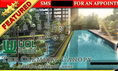
If you think that the property agencies will preserve and protect this wonderful logo when featuring this property in their adverts, you are so wrong. I cropped some adverts to remove the faces of the property agents, so the focus can be on the tortured logo.
 |
| After this condo is built, I'll be sure to take a picture at the entrance #goals |
 |
| Defend the logo by wrapping it in white! |
|
When in doubt, stretch! Stretch your agency's logo too!
 |
| Another protective bubble. This time, more fancy |
 |
| I won't blame you if you fail to see the logo here |
Feeling sick after looking at the picture above? Here is your medication:
Much better.


CONVERSATION